In 2017, Branded Cities Network acquired 100% ownership of Clear Channel Outdoor’s Canadian operations, expanding their presence across North America. I helped rebrand the Canadian offices, which included building a new and interactive website, winning industry awards and hosting a client appreciation event. ⸻ brandedcities.com
- My role/scope:
- Creative and design lead
- Audience research, media planning
- Art direction, branding, campaign strategy
- Media production
- Credits:
- Director of Marketing: Natalia Lafforgue
- Graphic Designer (Canada): Sherin Kwan
- Marketing Specialist: Alex Franco
- Graphic Designer (US): Tyler French
- With Spotzi (mapping)
- Results:
- Successful rebrand and positioning for a Canadian audience
- New websites built for self-serve campaign planning and online sales funnel
- 4x award winner at Ad Club Toronto's 6th annual Out-of-Home Showdown
Iconic media, iconic destinations – the value proposition that defines its brand marketing and sales strategy.
So what differentiates the Canadian operations from its US counterpart? Categorically, the US operation sells by market, while Canada sells by locale and segmentation. Branded Cities US is about reach and impact; Canada is more about thought leadership and convergence on the path to purchase. Visually, for Branded Cities US, their brand was reflected through the use of photography to showcase best use examples of out-of-home advertising along with a deep contrasting colour palette. More focus was put on the numbers taken at face value rather than narrative storytelling.

The orange-red represents the brand’s reach and scale in a visceral, visual manner.
The colour is bold, demands attention and gives off energy, just like their signs. This colour, of course, was non-negotiable when it came to its usage. But while it remained, other colours applied in US marketing materials – slate blue, red and grey – were downplayed (but not removed) in favour of white to move away from the varying contrast the colour palette generated.
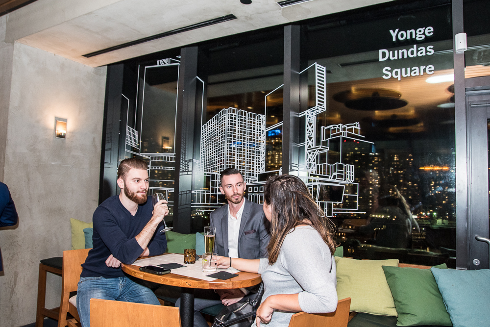
While photographs remained important to showcasing the assets, line graphics and basic shapes were used in various ways to represent abstract or categorical offerings – such as Yonge-Dundas Square or digital activations. It wouldn't be long until US marketing would adapt this approach.









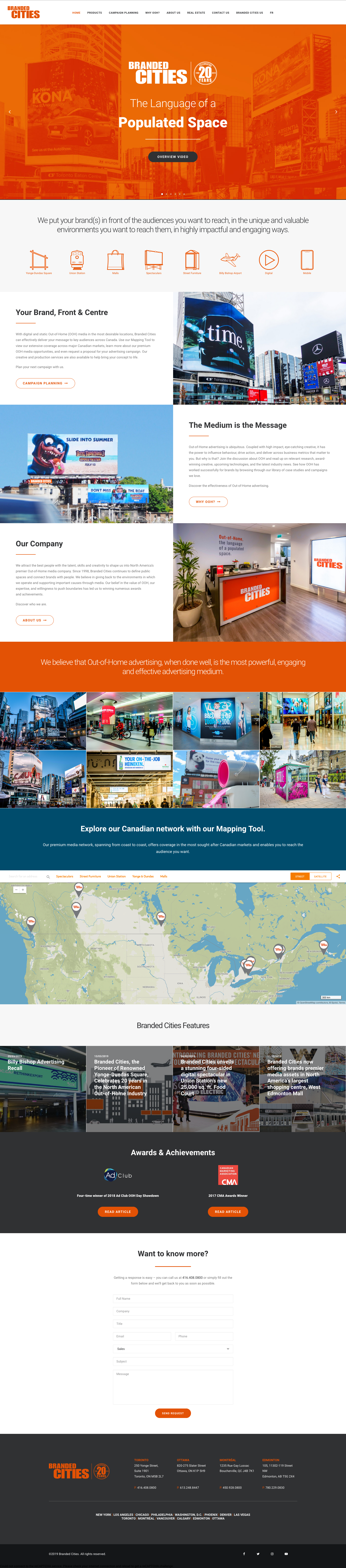
We wanted the website to not only market assets – we wanted to empower clients to plan their campaigns more easily and conveniently.
Powered and built by geomarketing platform Spotzi, we designed a campaign planning tool that harnessed the power of geolocation data and our sales marketing assets to give clients an online media buying experience. Users could visually browse through our inventory; view things like proximity, reach and location; and if so desired, select our products or packages to “buy” for their campaign (in actuality, it sent an inquiry to the sales team to follow up). This provided another method to indirectly funnel prospects to the sales team. You can try the latest version of the tool below.
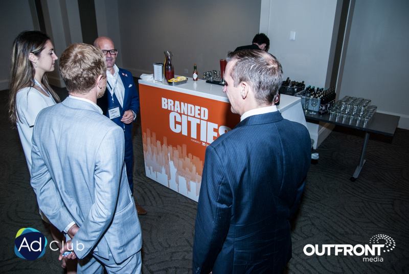
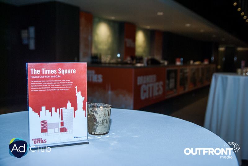
Branded Cities won 4 out of 9 awards at Ad Club Toronto's Out-of-Home Showdown.
All nomination videos were written, produced and created by me. We also sponsored the bar, allowing us to promote our brand anywhere they served alcohol to guests.

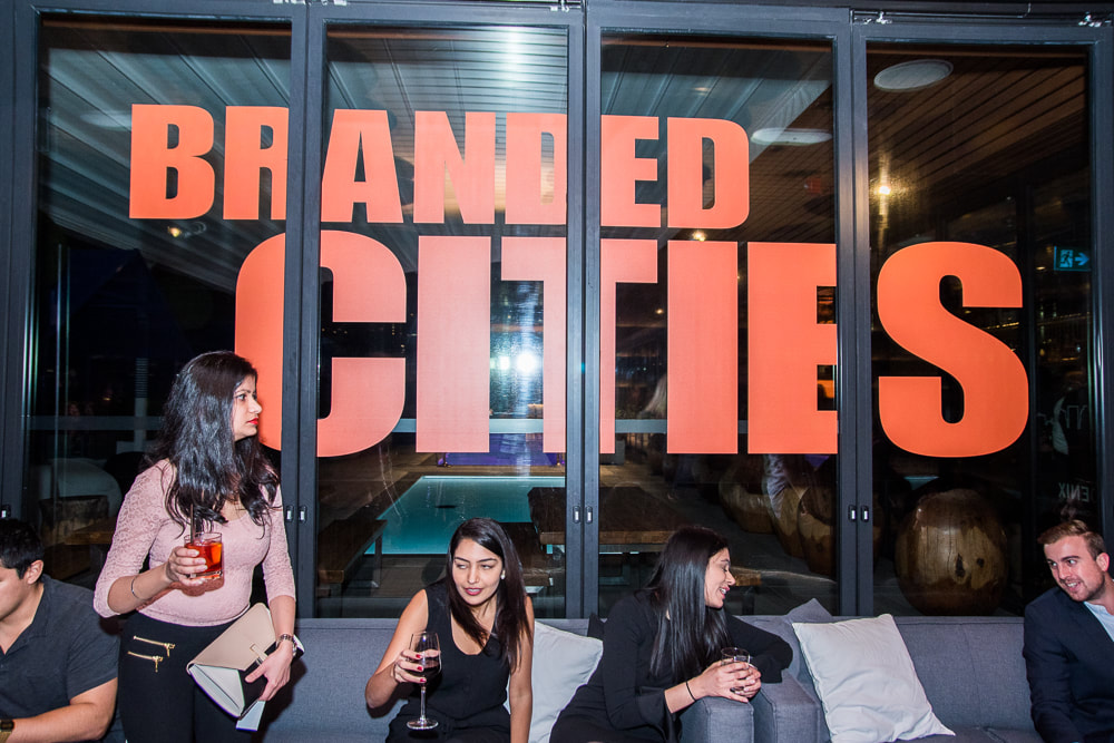
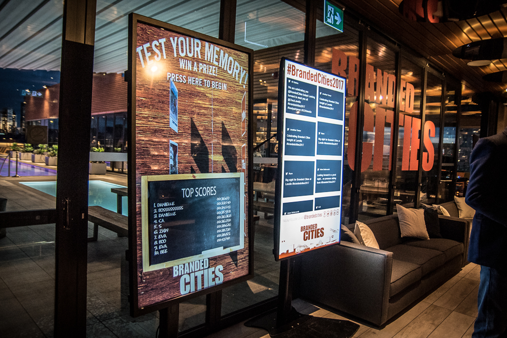
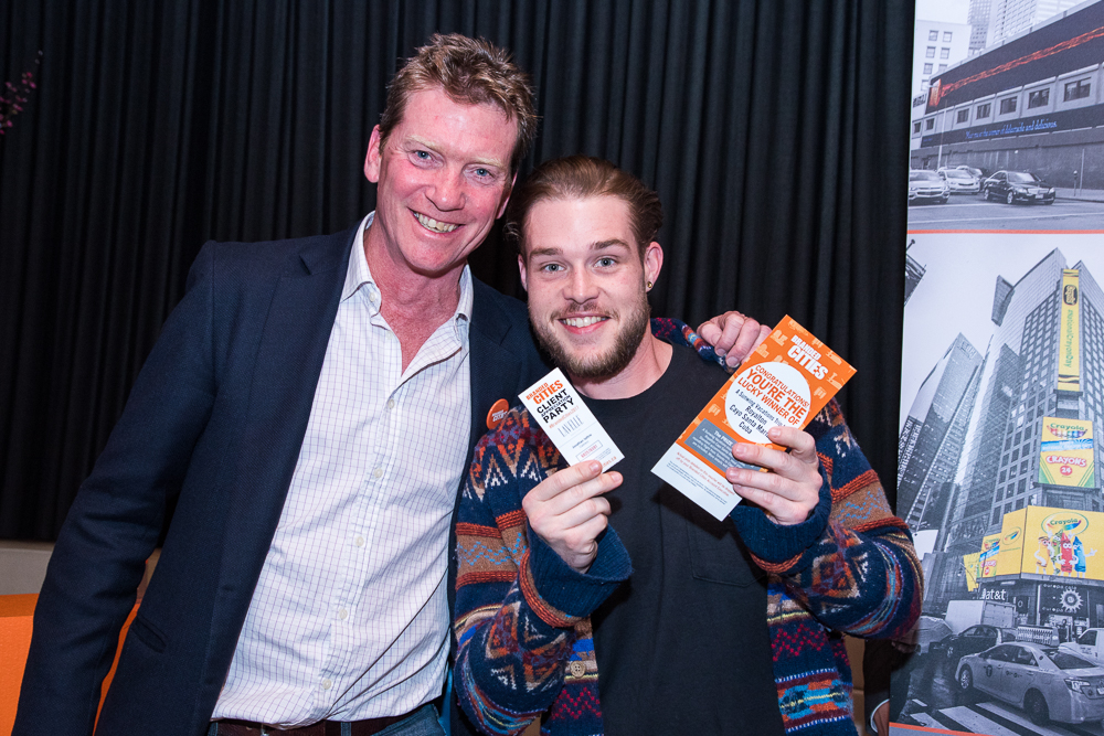
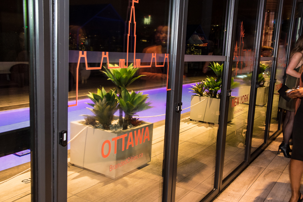
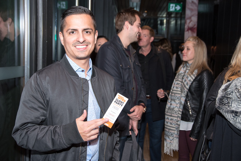
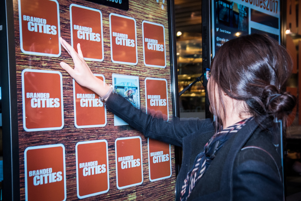
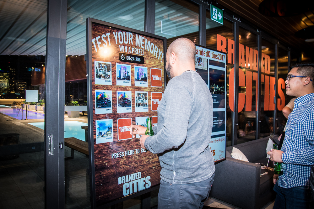
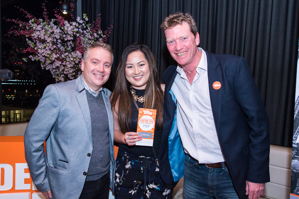
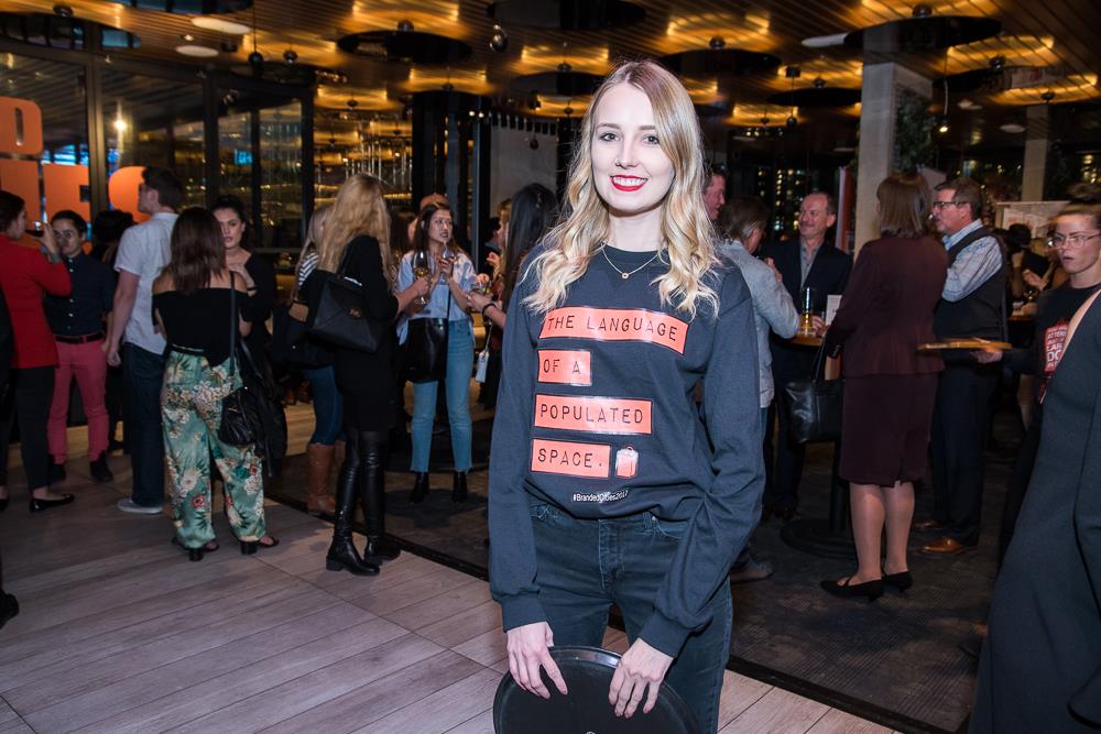
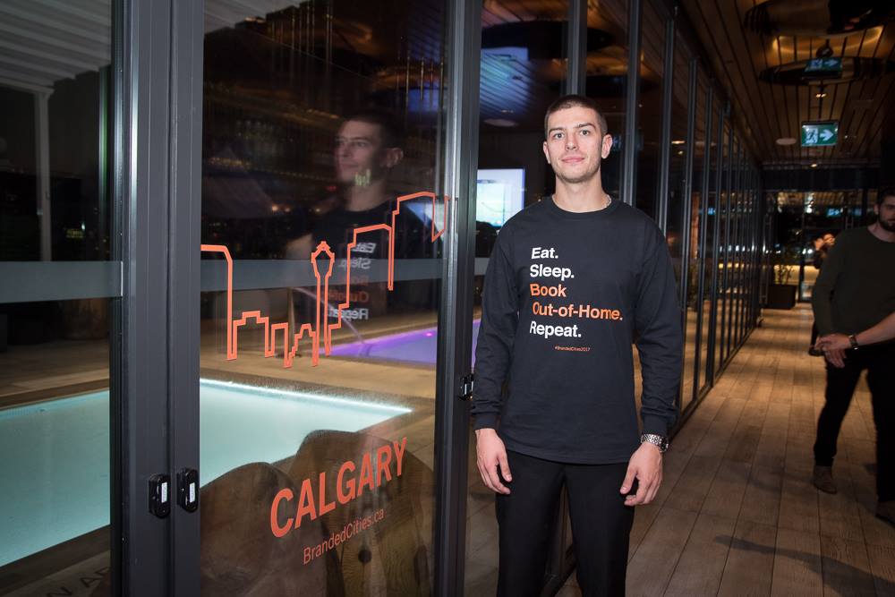
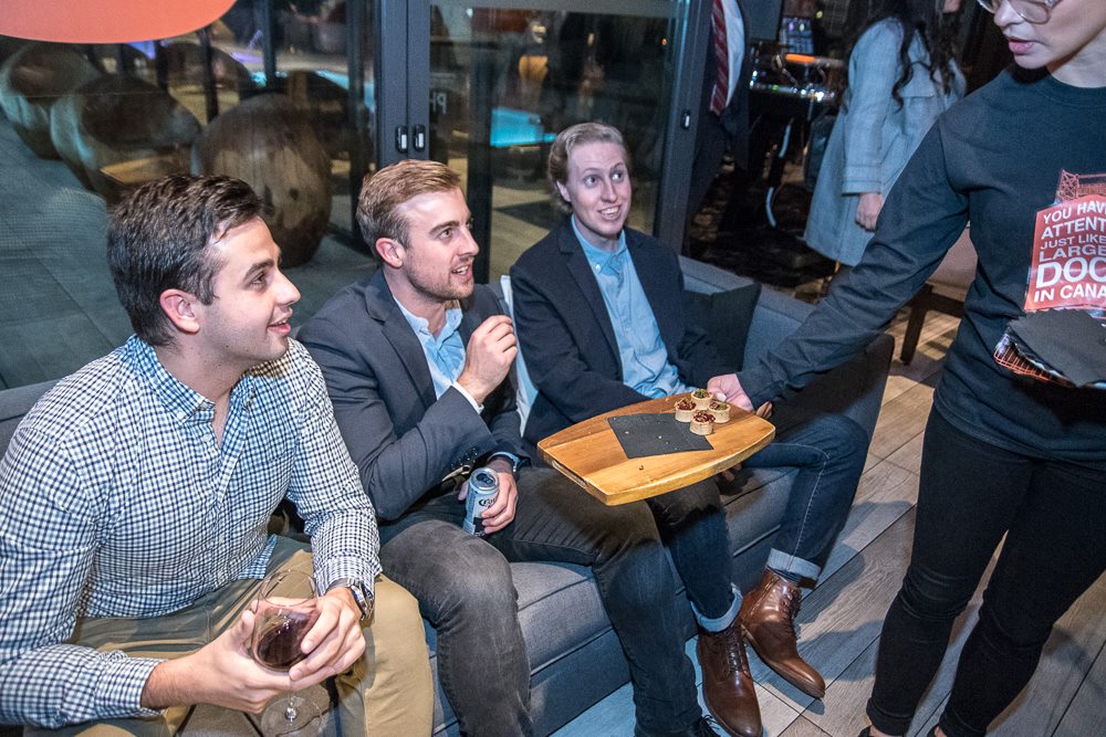
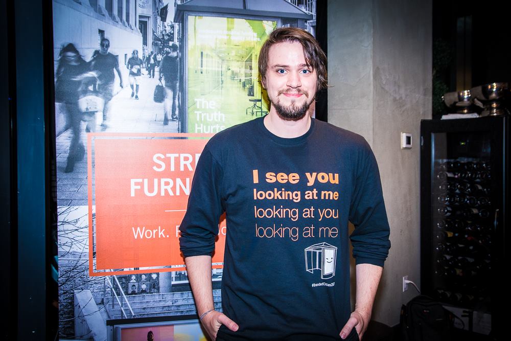
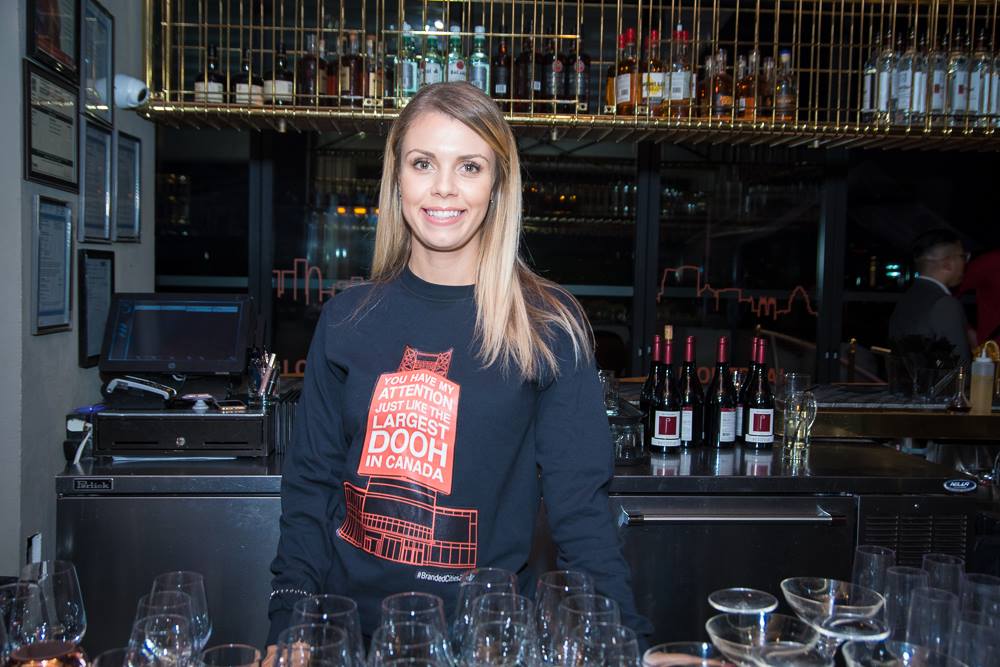
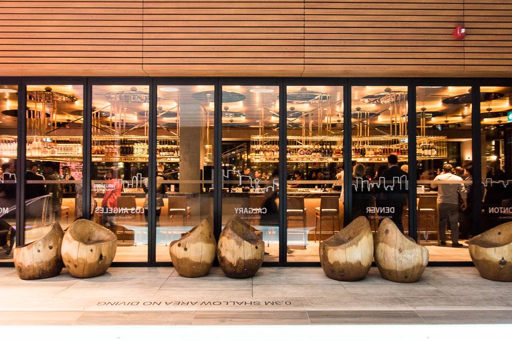
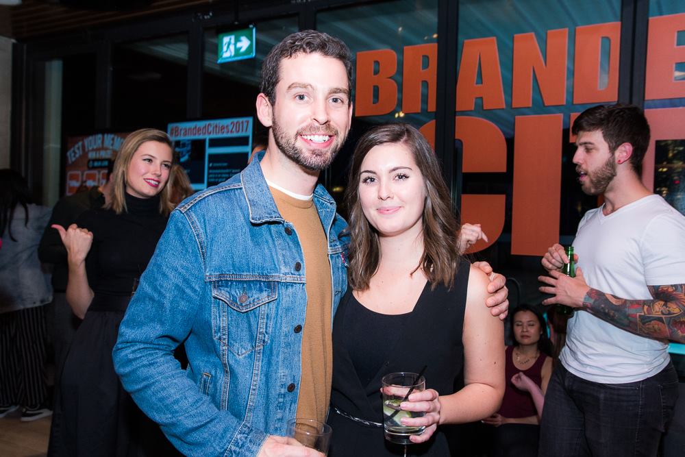
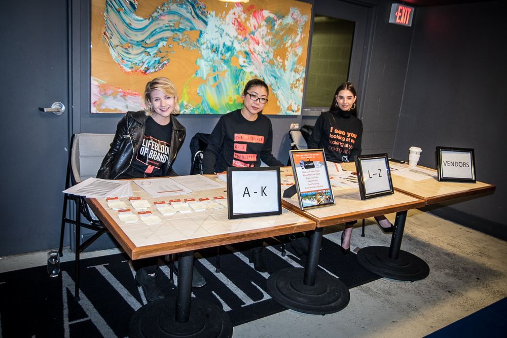
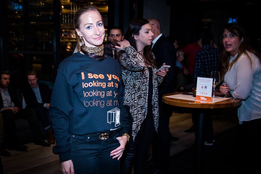
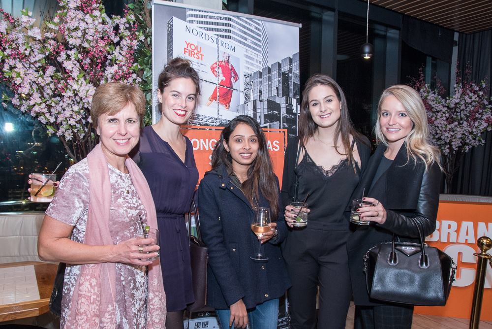
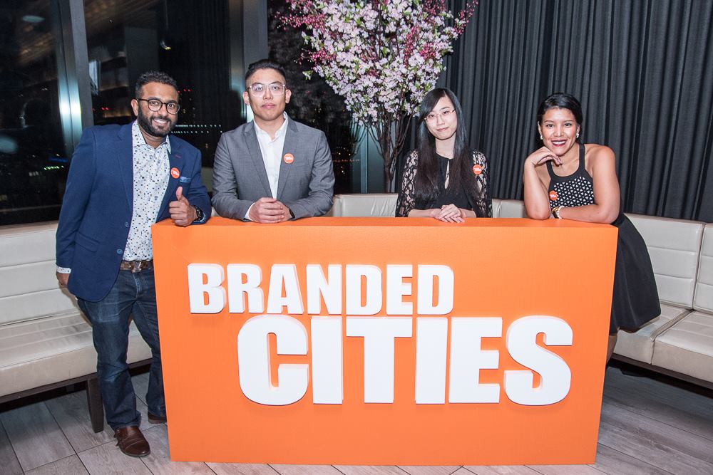
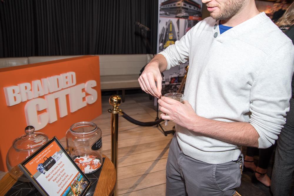
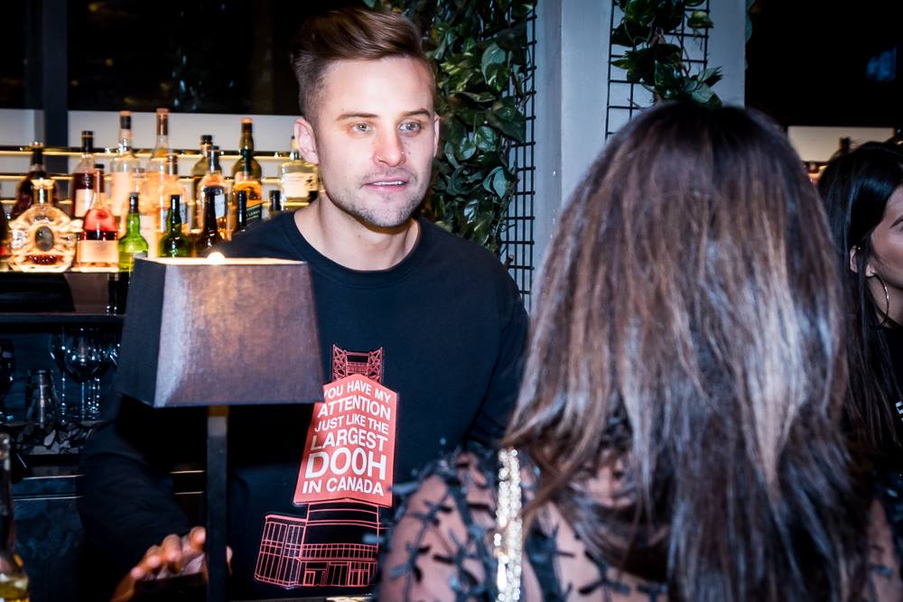
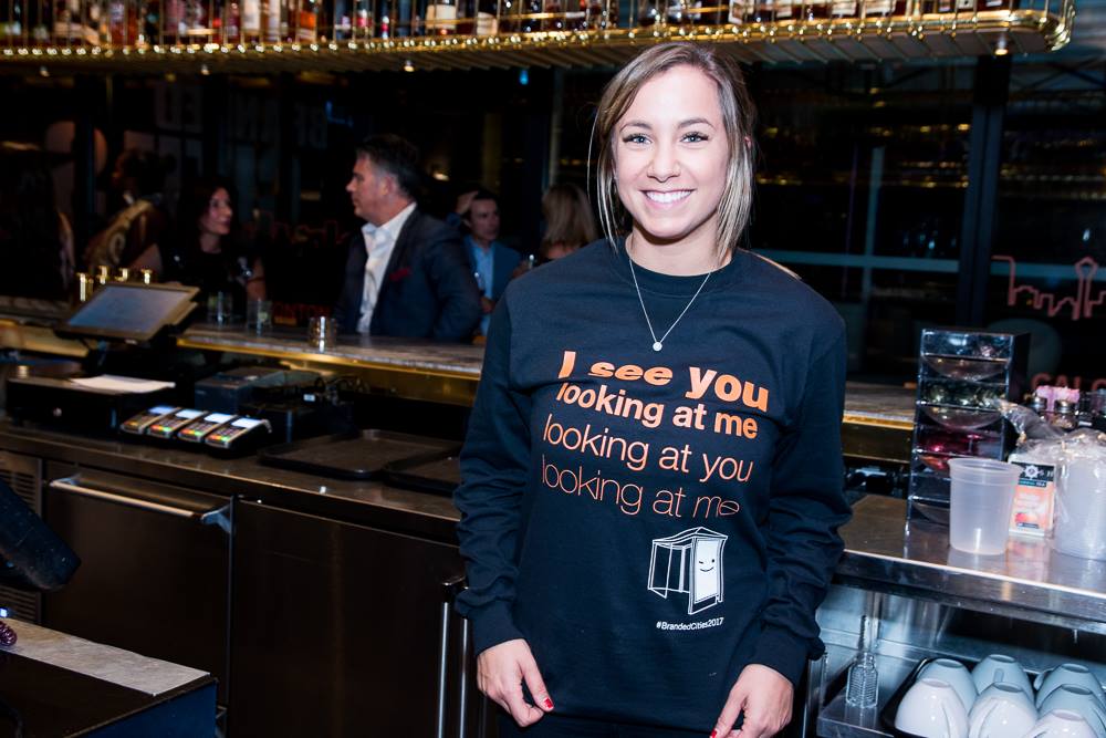
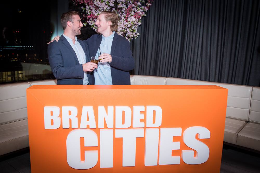
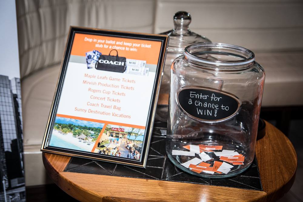
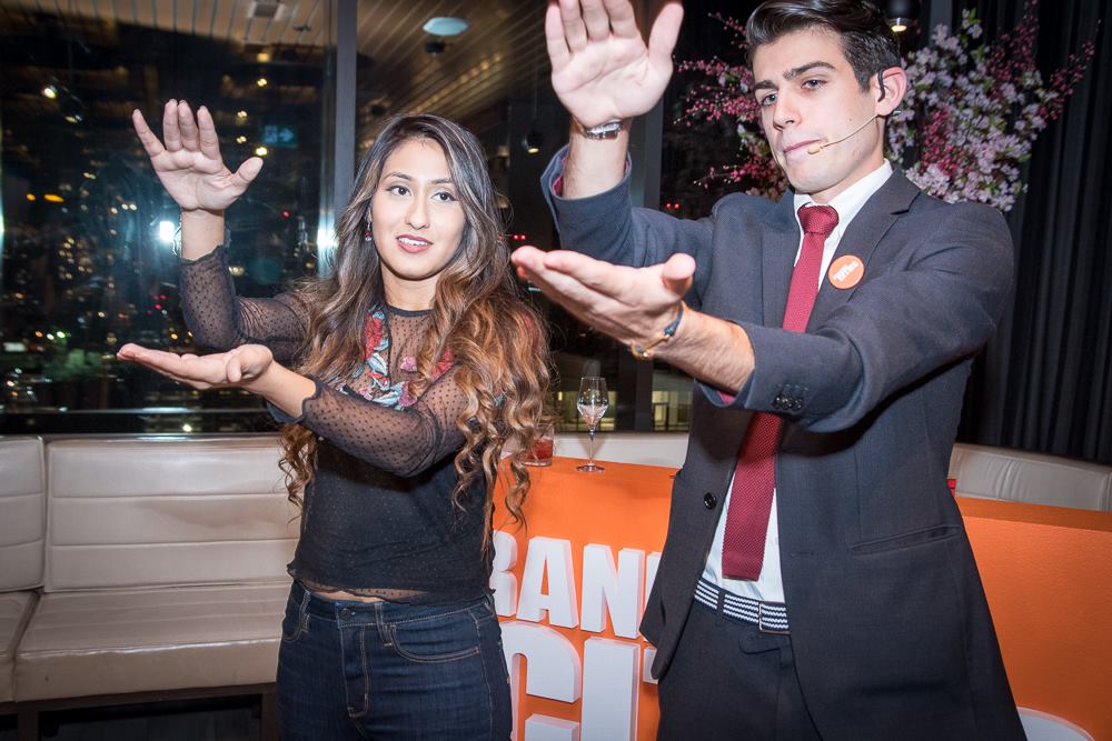
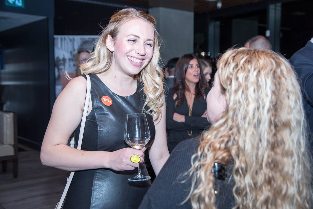
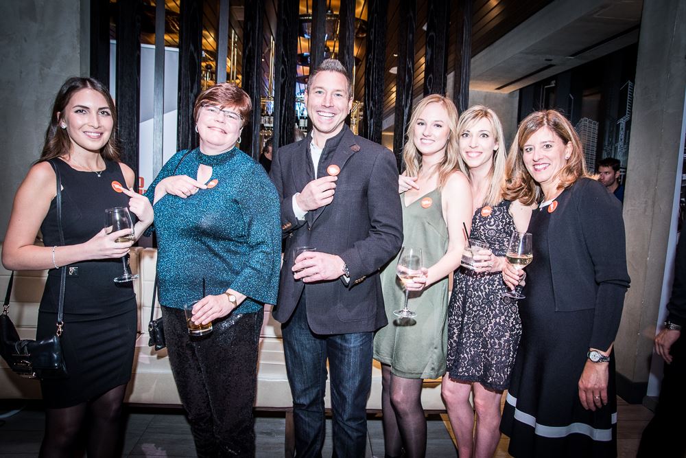
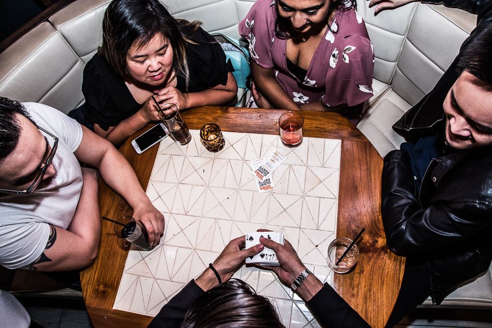
#BrandedCities2017Client Appreciation Party
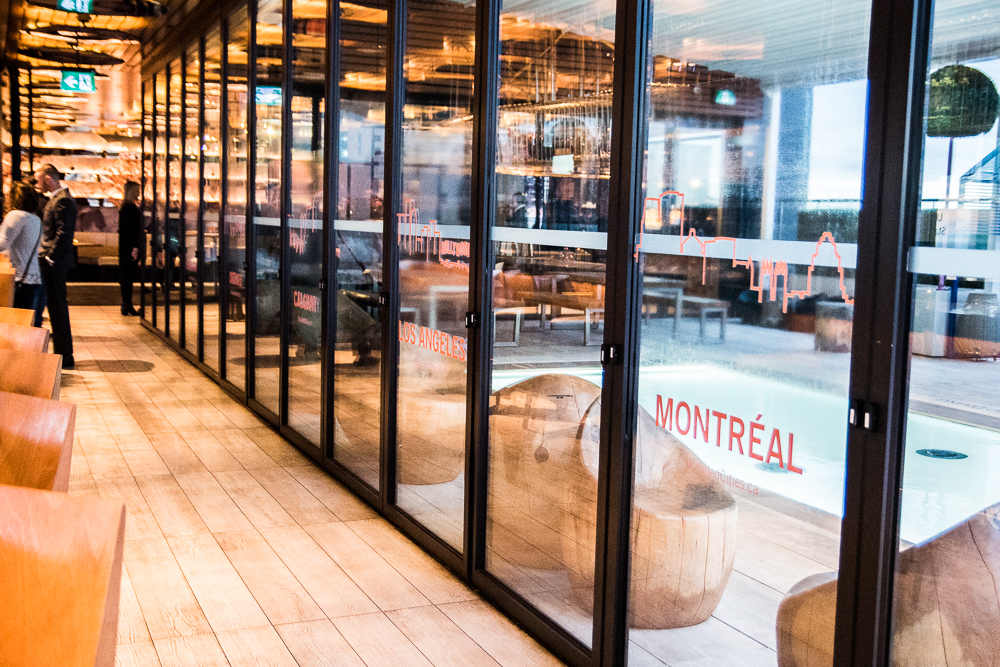
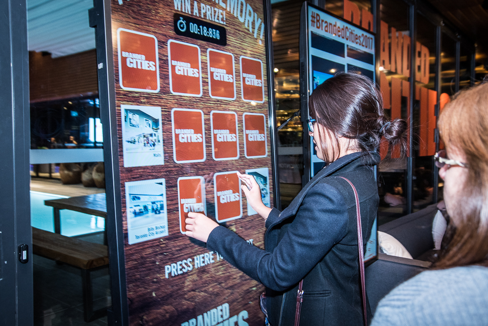
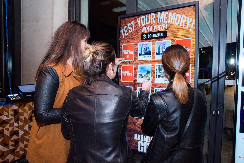
The entire event was managed by the marketing team, with my graphic designer and I taking care of the event branding, activations and promotional merchandise. I was also responsible for developing the UI for a memory game touchscreen activation and social media wall whereby guests could interact and engage with the party.