
- My role/scope:
- Design lead, project manager
- User research, information architecture, prototyping, UI design
- Art direction, branding
- Credits:
- Accessibility Consultant: Alex Tait
- Lead Developer: Alison Tarr
- Developer: Jason Thomson
- Results:
- Clear information architecture and user journey
- Refreshed design look to better align with key audiences
- Fully accessible in compliance with AODA and WCAG 2.0
- Improved donorship funnel for receiving donations
The Foundation needed a new website to distinguish themselves as a charitable entity separate from Artscape.
Due to a new donor campaign in the fall and another Artscape project in the pipeline, a hard deadline to deliver was in place. Accessibility was also a high priority for a number of reasons. First – to support their mandate on equity, diversity and inclusion, and second – to ensure compliance with the Accessibility for Ontarians with Disabilities Act (AODA) and to meet the W3C Web Content Accessibility Guidelines (WCAG) 2.0 AA.
Work began with the fund development team to outline objectives and their paths to donation, followed by an online accessibility consultant to assess and advise on the work and deliverables. A two-person, front-end development team familiar with online accessibility was also involved in the build, ensuring continuity and consistency in the design system.
The website needed to serve two purposes.
1) Create a robust donation funnel for individuals to make donations to the Foundation via the website.
2) Provide information about the Foundation for potential partnerships, donors and corporate giving.
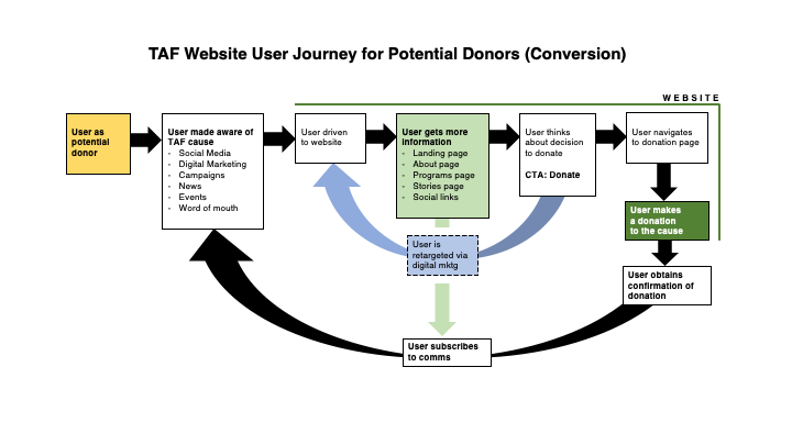
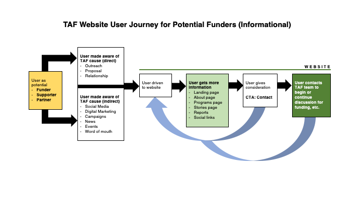
The design process itself proved challenging due to two reasons.
First – guidelines about typography, layout, colour, dynamic content and certain components set perceived limitations on certain design practices, choices and styles. I was used to web design and UI conventions that leaned more towards aesthetics than accessibility.
Second – working towards a most viable product on a tight deadline only allowed for an iterative, agile process between design and development – shortening any time allotted for ideation and innovation; important for creating a design system having online accessibility in mind.

We went with a simplistic design system that focused on basic colour, hierarchy and repetition.
At the time, most of the web sites I researched were either aesthetically pleasing but an accessibility test failure; or were fully accessible, but too utilitarian and just plain bad (design-wise) for my taste. The challenge of finding a balance between aesthetics and accessibility was exciting to me.
There were no visual wireframes made for this website, however page layout and information architecture were structured off of organized content and copy. Using Adobe XD, design began with a “mockup” of the homepage which would dictate the overall look and feel of the design system. Visualizing web site components and content as modular, reusable elements helped to not only streamline the design process and development, but ensured adherence to accessibility guidelines.





The project wasn’t without its shortcomings.
The donation platform used by the Foundation – CanadaHelps, was not made to be fully accessible and no viable alternative exists resulting in that part of the site having to remain. To mitigate this, we added text at the bottom making the issue known and to contact us if assistance was needed. Aside from that, prospective donors could now find a more accessible experience when engaging with the Foundation online.